When it comes to business cards, there is no end to the designs you can try out. However, if you really want to stand out, you might be better off sticking with something simple.
While business cards may feel like a relic from days gone by, they’re still used often for real-world networking. The trouble is, with so many armchair (or professional) designers out there, elaborate and zealously colourful cards rule the day. As business blog Inc points out, simpler designs — ironically — may do a better job of catching the eye:
In a word: simpler. Says Jay Harper, a winner of Build’s design contest: “It is quite common to come across business cards that are so overly designed they are hard to even look at.” Simple will make you stand out.
Of course, this doesn’t mean going with just black text on a white card so much as picking the most important elements (your name and primary contact info) and emphasising them while letting everything else fall into the background. If you do go for a regular monochrome card though, may we recommend a subtle, off-white colouring?
Comments
8 responses to “Keep Your Business Card Simple To Stand Out More”
‘I’m sorry but it doesn’t……pop.’ – every client who sees a design like this.
One word…. Emboss
Makes it look much more professional
High contrast and crisp clean fonts so when I come to scan it the text recognition software can make a better guess at the letters/numbers.
I’ve just digitised a heap of cards and the “fancy” ones are a PIA for text recognition – as are the graduated colours that probably cost a mint to have printed.
Does anyone know an online Australian Business Card printer who does raised lettering or embossed lettering?
It’s easy to make that design on something like vistaprint, but the top google matches don’t do the fancy print.
And now, with all your readers doing this, you have thousands of business cards that look plain and dull. So none of them stand out.
You’re better off using your brand’s colours, and tying it in with the rest of your business stationery.
I’m glad that a lot of cards look crap, the busy ones, and the ugly ones like the photo in this article.
That way my cards stand out.
Using a GOOD designer will make sure your cards stand out for the right reasons.
We have such good printing methods, card stock and spot/emboss available these days, that people don’t need to worry about and extra few dollars to get the right finish. Let the designer come up with ideas (typeface/layout etc) and show what is available.
On a business card, LESS is DEFINITELY MORE!, but it doesn’t need to be ugly like the example above.
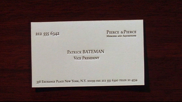
All you people dissing the business card from the article obviously don’t know who Patrick Bateman is 🙂
I mean, sadistic serial killers don’t like people bagging out their cards…
Oh my God, it even has a watermark!